


Adventures in Self-Publishing
I make the mistakes so you don't have to

Can you judge a book by its cover?
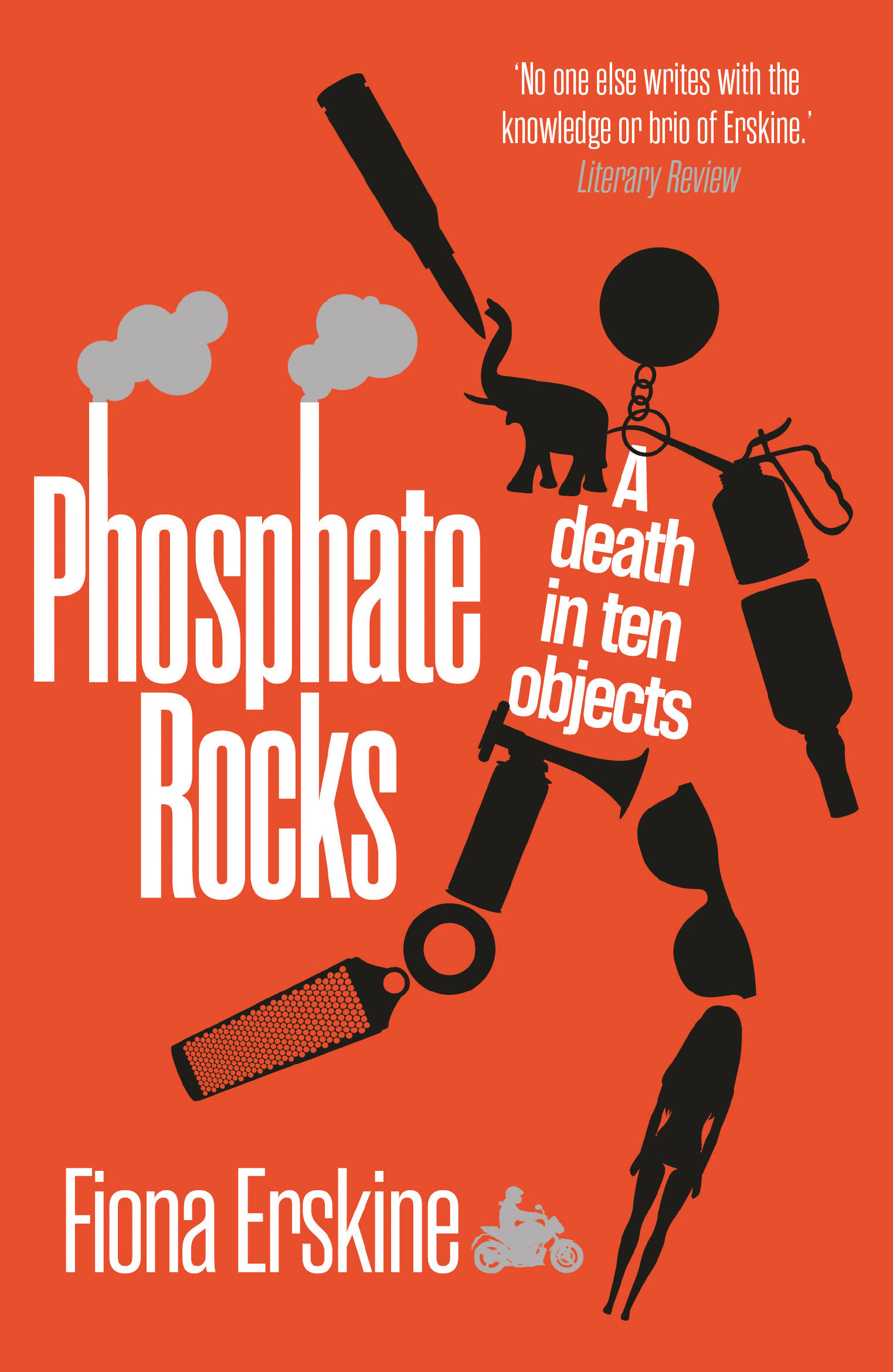
The story so far - In January 2024 I decided to self-publish Phosphate Rocks: A Death in Ten Objects after my previous publisher (Sandstone Press) went into liquidation.
One of the things I learned from marketing guru
was the importance of a good (ie professionally designed) cover.At first I thought I might be able to use the beautiful original Sandstone Press cover, but trying to get answers from the liquidator was about as easy as extracting blood from a stone.
The wonderful Society of Authors advised me to start afresh. ‘Who ever owns the rights to the cover, it’s not you.’
So I went back to the original designer, Mark Swan at kid-ethic, to ask for help. There’s a full Q&A with him at the end of this post (previously published on my website but always worth revisiting!).
e-book
On all the platforms, e-books are easy to publish. Upload your story (as an .epub file), a cover image (.jpg accepted by most) and your book is ready.
Easy! Or too easy? Dangerously easy.
To get a good-looking book cover, it’s not enough to have the right illustration, information and typeface, you also need it in the form of a good quality image with a the right size ratio. If you use the wrong dimensions, each platform will either crop or distort the picture.
KOBO: Advice Here
KDP: Advice Here
Barnes and Noble: Thank you Sarra for the Advice Here
Paperback (Print on Demand)
The paperback cover is a bit more complicated. First step is to choose the book size (trim).
During the printing process multiple pages are printed on rolls of paper and then cut (or trimmed) to the specified size. Within limits, the larger the book - the fewer the pages and the lower the cost of print-on-demand.
Many UK trade paperbacks are UK B format (129 x 198mm), but most self-publishing platforms have a US Bias, so I opted for a single size available across the platforms which was closest to the original Sandstone Press edition of my book.
I selected 5” x 8” (127 x 203mm) trim, black and white on crème paper inside , with a full colour cover in a matt finish.
With a single trim, I assumed that I’d only need a single cover design across all platforms.
Think again:
For the same book, of the same size, with the same number of pages, I needed a slightly modified design for each platform.
The KDP (Amazon) was platform was straightforward to use, but there were then several days tooing and froing over my right to publish - delaying release by over a week. Now that’s sorted, the ease and cost effectiveness is amazing.
All sales via KDP to date - 14 (10 in UK and 4 in USA)
Bookshops, for understandable reasons, prefer not to support their greatest rival, so I needed printers other than KDP. I chose Barnes and Noble (B&N) and Ingram Spark.
I’m not quite sure what I did wrong with B&N, but they wouldn’t let me use the same ISBN (unique identifying number) used for the paperback with KDP and Ingram Spark. I had to release another of my precious ISBN numbers and change the cover design to provide a blank box as they insist on adding (my) ISBN separately.
Sales via B&N so far - Zero
I chose Ingram Spark because they can supply Gardners in the UK who in turn supply bookshops.
However - there were several problems.
Given the print cost, distribution cost and bookshop incentive, I was going to make a loss on every book supplied unless I lowered the discount (recommended 55% for distribution + bookshop profit) or raised the sales price.
Bookshops don’t generally pay for a book until it sells and can usually return unsold stock free of charge. Ingram Spark UK returns policy is to destroy any returned book and charge the author the print cost, introducing a completely unknown and uncontrollable financial risk as well as a crime against trees.
Despite repeated attempts - Ingram Spark could not get the cover art centred, and the uneven borders irritate me.
The listing on Gardners STILL Doesn’t show an image
Bookshop.org (the online platform for independent bookshops) will only list titles available in stock from Gardeners - apparently ruling out Print on Demand.
Sales to bookshops via Ingram Spark to date - Zero
I asked advice from other ALLi members and contacted a range of printers.
Unsurprisingly, the cost per book goes down with larger print runs. However the financial risk, risk to trees and domestic harmony (try storing 2,000 books in your living room!) far outweighs the cost of print on demand for this project at least).

Several UK ALLi members recommended BookVault. Their platform is extremely easy to use, they price competitively for Print on Demand, and are both responsive and helpful. Best of all, the cover art is now perfectly centred!
It’s possible dispatch direct from BookVault to any address and include your own invoice. Distribution to bookshops is now in my hands - watch this space.
Finally, the part you’ve all been waiting for …
Q&A with kid-ethic
How did a nice boy like you end up in a place like this?
My name is Mark Swan. I am older than makes sense to me and I live on the south coast by the sea. I run kid-ethic studio and produce book covers and album art and listen to a lot of music.
I left university with an illustration degree and no real idea where I could fit in the creative industry. I worked as an illustrator for a fair few years doing magazine and newspaper article illustrations including a weekly column in the Financial Times. I loved film so I contacted Sight and Sound magazine to do some illustration work. Sight and Sound is run by the BFI and my folio was passed to their publishing division. Luckily I was given a commission to create the cover for a book about Alfred Hitchcock.
I had never really considered doing book cover work but it was the eureka moment and a whole career opened up to me. I didn't want to be cornered into any one style, which is a risk for illustrators, but book cover work allowed me to work in many different style, mediums and genres.

First option selected for new cover
How much of your work is for self-published authors ?
I would say that my work for self-published authors is on the rise. Some authors have made a real name for themselves through self-publishing and have built huge followings which has inspired others to take control and go it alone outside of the normal publishing channels.
I find it really fantastic that authors now have this option given how hard it can be to get published and all the rejection that goes with it. I really do love working directly with authors. I feel so much more a part of their journey and creative vision.

Option rejected
How much does it cost?
The price really does vary from project to project, publisher to publisher and country to country. You will be looking at anything between £150-£2,000. Hardback covers cost the most to design, then paperback, e-book and then audio. Audio is generally licensed by the company producing the audio book and they tend to adapt the artwork themselves.

Option rejected
How long does it take?
Anywhere between 30 minutes to several days. Some ideas and designs come very quickly whilst others really have to be wrestled with, tamed and developed. I feel if a design isn’t clicking after a few days then it most likely never will. That said you can be working on two designs that are going nowhere and then find that if you combine the two you get a finished cover.
Once you have an approved design there is usually a big gap until you complete the rest of the cover and then another gap for it to be printed and then released. All said, the project can last around a year to a year and a half.

Option rejected
How do you approach a new project?
A typical brief will include a synopses, an indication of genre and the readership the publisher is trying to attract and examples of other book covers or images that have the right feel. Objects or key locations can be really useful. I try to get hold of the manuscript so I can get a feel
for the book and its style. I won’t read to much as I don’t want to know any particular plot details or twists should they colour my creative direction. This has lead me to having read many more books than I have finished!
I’m also a very slow reader. Lots of times an image will form in my head whilst reading the brief. If not, I will look at creative books or go to a picture library (online websites of illustrations and photography that can be licensed) and type relevant words into their search engines and see what images come up and then move forward, jumping from image to word to image to word. I find just writing down words and then then going to the thesaurus can generate visual ideas.

Option rejected
How many alternatives do you present?
I have a rule to do a minimum of 3 initial visuals for the author/publisher to choose from. In a few instances I have done only one if I felt I had hit on the right direction (but only with people who I have a good working and creative relationship with). I’ve done projects that have been approved on the first round of visuals and then some have gone on for a very long time with
many many many iterations. Generally speaking, the more people involved in the decision, the harder it is to get a design approved, but it can also go the other way as well. Authors spend so much time and pour so much soul into their books that they can have a clear image or feeling on what they want the cover to look like and so getting a cover approved that matches their vision
can be tough. I would say that if an author has come to you directly then they see something in your style and concepts that they click with and tend to trust you with you creative vision. Either way I like to try and work with a client and combine our skills.

Option rejected
What additional information do you need?
At the beginning I will need the title, author name, subtitle and hopefully any quotes that will appear on the cover. Also I will need the dimensions and whether it’s a paperback or hardback or both. Later, when the cover image is approved, I will be sent the final cover copy and the spine size plus ISBN to lay up the rest of the cover.

Option rejected
What are the golden rules?
Like all creative endeavours, there are no rules. There are some things that need to be considered when designing. Say for instance the cover is going to be primarily online then you need the design to have an impact as a thumbnail.
Think about your genre and reader demographic. When I think of covers that have
been successful, they tend to be ones that step outside of trends and do something fresh whilst having strong connections to their genre.
I read a great quote today that really struck me: “ If you follow the crowd you will only get as far as the crowd"

Colour scheme rejected
Do you ever refuse projects?
Not really. The only reason that I turn down work is when I’m really busy and can’t give the project the time it deserves. I suppose I would turn down certain projects for ethical reasons but
I’ve never encountered that problem so far. I have had to turn down projects due to their budget but that said I’ve certainly done projects with small budgets because the project excites me creatively

Colour scheme rejected
Give me a design example of one of your favourite projects
I really love doing poetry books and the cover I did for the complete proems of Philip Larkin is one I was really proud of:

http://kid-ethic.com/?portfolio=the-complete-poems-of-philip-larkin
I’m also a huge horror fan and loved doing the Six Stories covers:

http://kid-ethic.com/?portfolio=six-stories
Give me some examples of really bad covers ?
There is one set of covers that always bugged me. These books did very well so I’m sure I’m not going to upset anybody involved, but I always felt that the UK covers for The Girl With The Dragon Tattoo were not very good. A real missed opportunity. But like I said, they sold very well. I see lots of over bad covers, mainly in the self-publishing world. Mostly this can be down to font choice. The correct font choice really can make or break a design.

(And this one's even worse - other corkers if you follow the link HERE)

Both the above are most definitely not by kid-ethic
How much difference does a good cover make to book sales?
I think that it can be very important indeed. We are drawn to things that we find attractive, intriguing and new. Sometimes what draws us is familiarity. I liked that so I’m sure to like this so will buy it. A great cover can often suggest the quality of a book. If it looks professionally done then this means that what is inside must be quality.
A bad cover could suggest a bad book lies within.

Most definitely not by kid-ethic
Tell me a joke...
Did you hear about the woman who invented the knock knock joke?
She won the Nobel prize.
Mark, the cover doctor, can be contacted HERE
Phosphate Rocks: A Death in Ten Objects is available from Drake the Bookshop HERE or online at Kobo HERE and Barnes and Noble HERE (and the other place here).

Option Selected!